
Playstation
The PlayStation Store has become a key destination for gamers looking to discover new titles, but navigating it feels more like a chore than an exciting shopping experience. With cluttered layouts, missing filters, and a lack of visual appeal, finding the right game can be frustrating. As an avid gamer and UX designer, I saw an opportunity to enhance the store’s usability and bring back the excitement of discovering and purchasing games.
This redesign focuses on creating a more intuitive, engaging, and visually compelling experience. By reintroducing elements that evoke nostalgia—like full game box art—and improving navigation, filtering, and game detail visibility, my goal was to make the PlayStation Store feel less like a generic app marketplace and more like a true gaming destination. Here's how I approached it.
Company - N/A
Role - Product Designer
Tenure - 4 days

The Story
Have you noticed the PlayStation Store's layout recently? Over the past few months, it's become a bit of a maze. New releases sit next to featured games, and featured games sit next to "best hits" — it’s all over the place. As someone who’s always on the hunt for the next game to get hooked on, I often find myself lost in the store, unsure of where to look. The worst part? Running into games that aren’t new, or are single-player only, or—worst of all—a game created by one person using AI-generated assets and priced at $24.99. (Seriously, who at Sony is checking this?)
So, I decided to take matters into my own hands and redesign the store to improve the experience for users like me. My primary goal was to create a design that feels personal, user-friendly, and more enjoyable. Here's what I focused on:
1. Bring Back the Box Art
As a child, I loved flipping through the physical game cases, reading the back of the box, and studying the artwork. It was an experience! I’d love to see that same sense of excitement translated into the digital store by showcasing full game box art, including the back covers. It adds a touch of nostalgia and depth that’s missing in today’s store.
2. Make the Main Page Feel More Like a Store
Currently, the PlayStation Store feels more like an app store, with lots of small, square images. Why not return to showcasing full box art and design elements that make it feel like you’re browsing a real store rather than scrolling through a grid of thumbnails?
3. Improve Filters (Where’s the Multiplayer Option?)
Here’s something I absolutely despise about the PlayStation Store: there’s no “Multiplayer” filter! It’s a frustrating experience for me and many of my friends to stumble upon what looks like a great game, only to discover it’s single-player or has limited multiplayer options. It’s an easy fix, but a major game-changer in user experience.
4. Provide Full Game Details on the Game Page
When browsing a game, we should be able to instantly see key details — like the size of the game, and whether it’s single-player or multiplayer, or if an online connection is required. This would save time and help users make more informed purchasing decisions.
5. Reignite the Excitement of Digital Purchases
Remember the thrill of purchasing a physical game and rushing home to play it? In today’s digital world, we’ve lost that excitement. Why not bring some of that magic back? I’d love to see some kind of engaging animation when purchasing a game, like the game case sliding into a digital bag, to make the experience feel more celebratory.
My goal here isn’t to criticize PlayStation’s current design, but to highlight the potential that’s already there. The PlayStation Store has great design elements, but with just a little more love and attention, it could be the place to discover and purchase games with ease and excitement. 💙

Current Design of the Playstation Store.
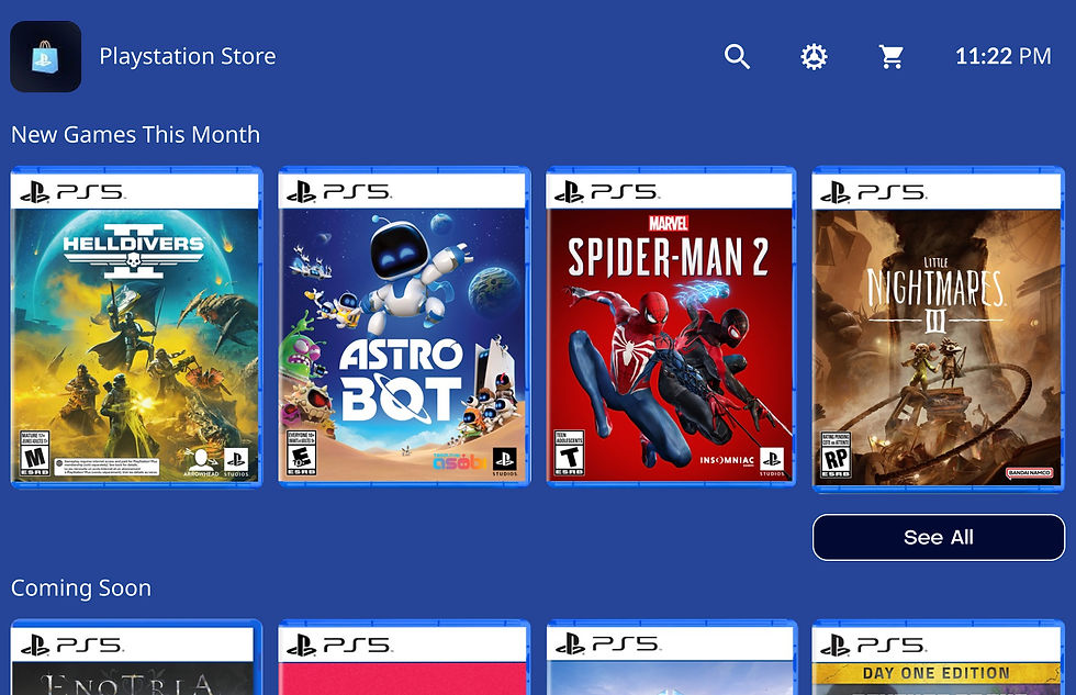
My Redesign of the Playstation Store.
.jpg)

.jpg)
.jpg)
.jpg)
.jpg)

.jpg)
.jpg)
.jpg)
.jpg)

.jpg)

